EHR visualization techniques enhance decision making
Vendors and developers should not shy away from new visualization techniques.

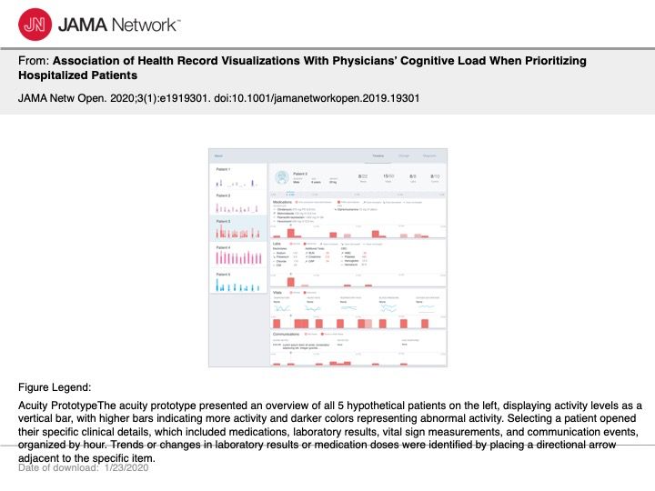
Figure 1; Click to View

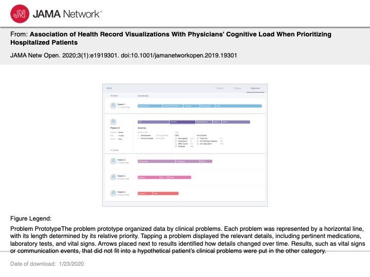
Figure 2; Click to View

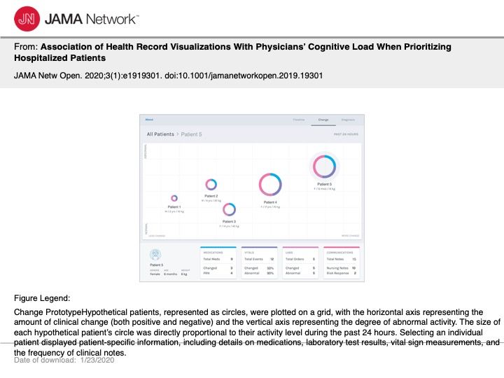
Figure 3; Click to View

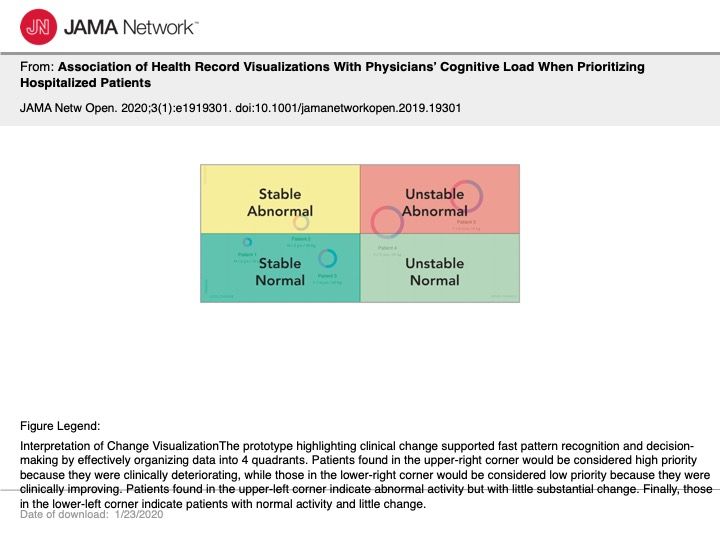
Figure 4; Click to View

Electronic health records (EHRs) that process, organize, and visualize clinically meaningful information patterns were shown to significantly reduce physician cognitive workload in a study recently published in JAMA.
EHRs typically present a lot of patient information across multiple locations, thus requiring physicians to hunt for the information they need. The process can be highly time-consuming and error prone.
To alleviate some of this stress, Ari. H. Pollack, MD, and Wanda Pratt, PhD, conducted a cross-sectional study that included 29 attending physicians at Seattle Children’s Hospital between August and October 2017 to assess which new EHR visualizations could decrease cognitive workload in determining patient priority.
Trending: 5 questions every older physician should ask themselves
Participants used three prototype EHR systems with novel visualization techniques that displayed information for hypothetical patients during a 24-hour stay at the hospital.
These novel visualizations included:
Acuity View (Figure 1)
- Associated acuity with patient activity by presenting details on the amount of clinical activity that had taken place over the hypothetical 24-hours
- Required 61 pages to present data
Problem View (Figure 2)
- Organize data into respective clinical problems, represented as a single horizontal bar
- Required 20 pages to present data (most compact)
Change View (Figures 3, 4)
- Patients plotted on to a grid, where clinical information represented as a circle
- The circle’s diameter indicated the amount of activity; horizontal axis placement indicated degree of change; and the vertical axis position indicated percentage of abnormal activity
Cognitive workload was measured using the NASA task Load Index scale (1-100), wherein lower scores indicated lower cognitive workloads. Cognitive workload was assessed for (1) finding information for a specific patient and (2) comparing results among patients for each prototype.
Of all three prototypes tested, the Change View returned the lowest TLX scores in 17 of the 29 participant rankings. 76 percent of participants also reported preferring this prototype visualization over the others, indicating physician openness to new visualization techniques that highlight clinically meaningful patterns.
Read More: Peer advice for managing a practice
“This organization supports pre-attentive processing,” the authors write,” [meaning] subconsciously recognizing visual patterns, by separating items based on location, resulting in rapid pattern recognition and data interpretation.”
The results of this study indicate that developers of EHR systems should not avoid creating new visualizations so long as the representation of clinically meaningful patterns enhance physician decision-making.
Specialty telemedicine for independent practices
March 29th 2021Physicians Practice® spoke with Dr. Jonathan Wisen, Founder and Chief Medical Officer of MediOrbis, about specialty telemedicine for the treatment of chronic conditions and how these technologies can improve a practice's offerings and patient outcomes.
Cybersecurity breach reports low during the pandemic
September 7th 2020A new report from CI Security suggests cybersecurity breaches were lower during healthcare's rapid transition to virtual care throughout the pandemic. In this episode of Perspectives, we look at why this might be and other aspects of their report with CI Security's Healthcare Executive Strategist, Drex DeFord.